Zones and shape of writing

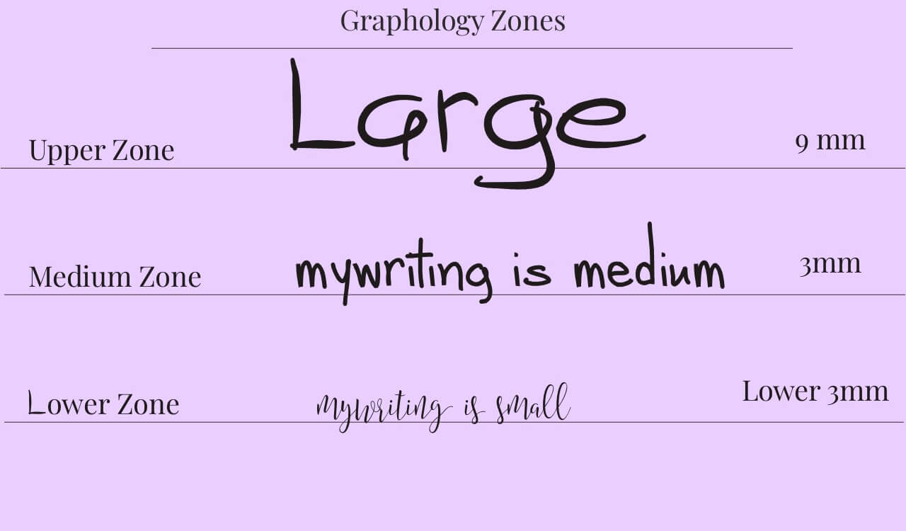
The specific shape of writing is a complex study that has a lot of detail that goes into the analysis and understanding of the meaning. I have done a super cool video on youtube about the different handwriting zones that I recommend checking out it is only one minute long. I wanted to start with the zones as they are super important when looking at the "overall" writing analysis.
The areas which are studied are the pressure of the writing utensil, the size, the slant (or slope), and the specific shapes that are created when letters are formed.
Handwriting Analysis - Slants and Slopes
The slope of the writing indicates the communication and openness of the writer. When you view writing that slants more to the left, the person is more likely to hold themselves back or be reserved. These people can be especially hard to read emotionally and have a tendency to be selfish with their emotions.
They are often also people that overextend themselves in generosity. The more left the slant, the more liberal they are with their giving tendencies and can sometimes be treated like a doormat if they are not careful. When the slant is more to the right the person can be more extroverted, however the more severe the slant the more the extroversion turns into being nosy or intrusive. People with excessive right slants to their writing often are overly emotional or dramatic and can be known to be manipulative and should not be trusted with too much information or responsibility.

Handwriting Analysis - Cursive Writing - What it Means?
Cursive writing especially can be telling regarding the slopes of letters themselves. While many schools of thoughts will talk about specific letters, for now we are going to focus more on the actual strokes than the letters themselves.
The slopes of the letters are broken into three zones – the upper zone, the middle zone, and the lower zone. Paying attention to the zones is sufficient to analyze the overall handwriting of a person.
Handwriting Analysis: Upper Zones
Grandiose upward strokes on the tops of letters that go to the top of a line as in the case of the letters L, T, and B can indicate the expectations of the individual. High strokes will show a person that wants to achieve or those they are high goal setters. They tend to expect a lot out of themselves and those around them.
Handwriting Analysis: Lower Zones
The area in lower case words especially with letters that do not reach the top or the bottom like m, e, and r will reflect the personal reflection of the self or essentially, how the person views themselves internally. Sometimes these letters will be read as the ego of the person with thinner middle letters representing less of an ego and wider or bubbly letters showing a strong ego.
The middle zones are often the hardest to read because different letters that are represented in the middle zone will be written differently. For example, a person will have a fat e or o but the a will be slight or the c will be grandiose. These areas are best reviewed individually, not letter by letter, but sort of statistically. You can get an idea if a person thinks highly of themselves in certain areas, such as if they start off with round bubbly letters and then as the writing continues and their hand gets tired the letters get more succinct and narrowed. Judge these letters on an overall basis while taking everything into account to make a full view judgment.
Handwriting Analysis: Lower Zones
The area beneath the line, as is the case with letters like G and Y (lower case of course) show how a person reacts in their life. If the letters are lacking a loop and come out to be straight lines, these people often are ones that hide or are secretive.
Those who write in the lower zone like to keep their private lives to themselves. A full loop on the bottom of these letters can represent a feeling of insecurity or codependent personalities. The loop on the bottom sometimes will be elongated but narrow, this will show someone that holds people close to them but will keep strangers at an arms distance. The lower zones especially can be tricky and if you are interested in focusing on cursive you may wish to explore the differences of each letter specifically as they have meanings within themselves.
Well, I hope you enjoyed this article and that you can define where your writing now falls.
By Florance Saul
Created: Mar 30, 2012 | Modified: May 11, 2024


